a1c app · 2025
I redesigned how a health app presents data — because the doctor was no longer in the room.
When clinical tools shift to everyday users, the app doesn't just need a simpler UI — it needs to absorb the role the doctor used to play.
Role
lead designer
company
GraphWear
stage
pre-Series C
duration
3 months

What I did here
my focus
Reframed the product problem
Identified that clinical-to-lifestyle expansion wasn't a UI problem; it was a role substitution problem
Designed the interpretation layer
Built a three-part system that replaces what a doctor does in a consultation: summarize, locate, explain
Protected simplicity under pressure
Pushed back on feature-adding requests that would have put interpretation load back onto the user
the outcome
An everyday glucose experience that tells users what happened, when, and why — without the presence of a doctor.
THE context
CGM desirability was proven. The question was whether it could serve a market 700x larger.
GraphWear was preparing for series C. The CGM product desirability was proven. The opportunity ahead was significantly larger — over 100 milions of Type 2 patients and prediabetic consumers who had never used a CGM before.
Expanding into that market didn't require new technology. It required a product those users could actually use without clinical support.
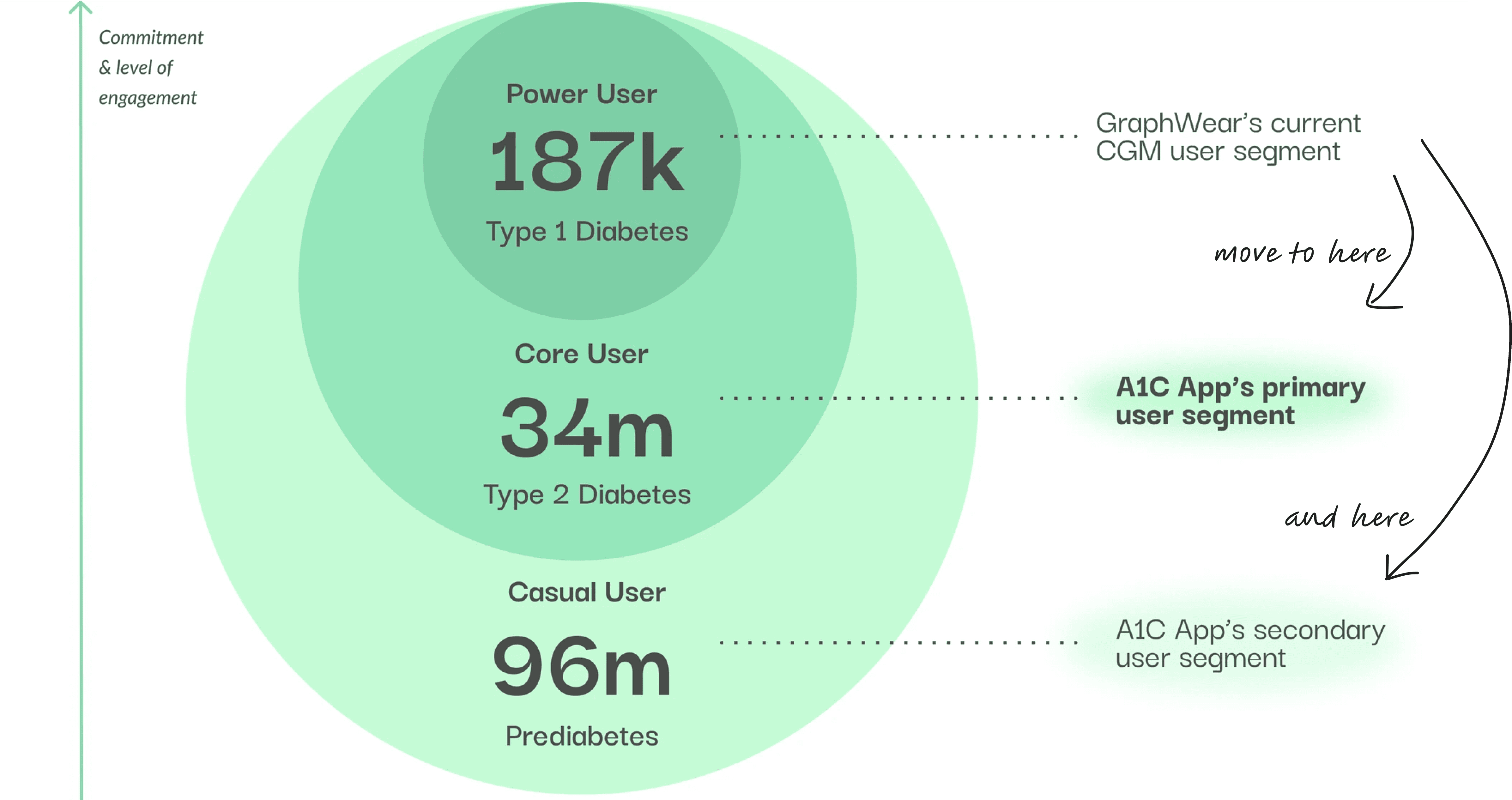
This diagram shows the expansion from power user to core & casual user
The reframe
Clinical and lifestyle look like the same product. They're not.
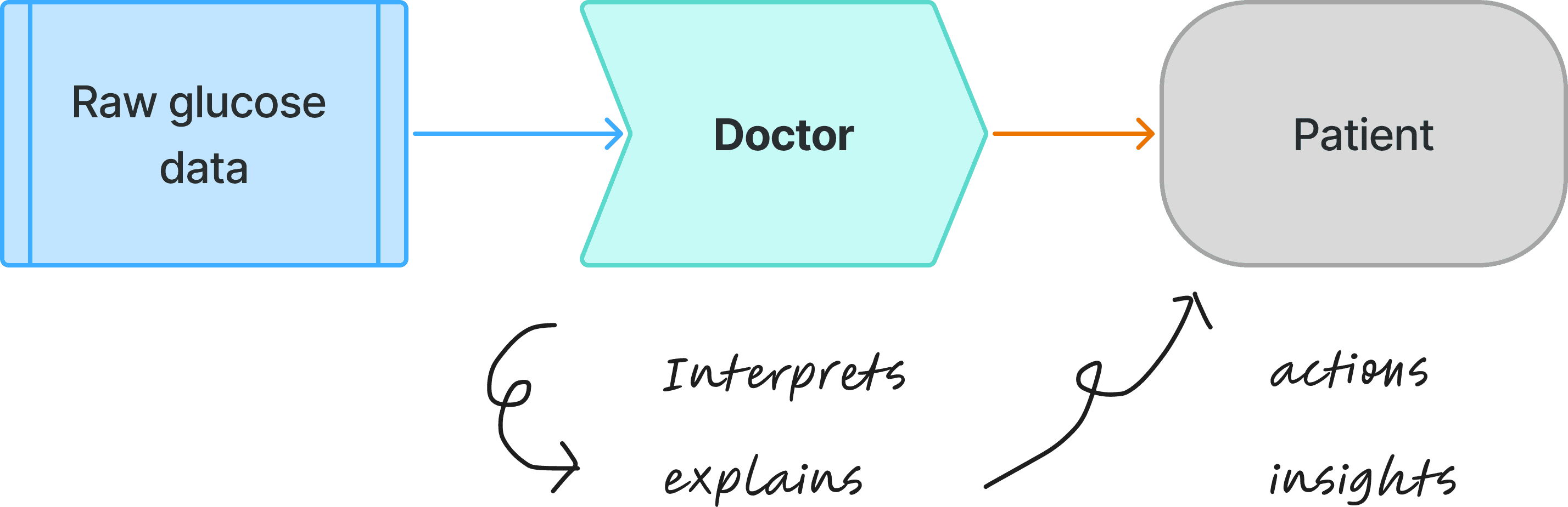
In clinical settings, doctors sit between the data and the patient — they interpret the numbers, explain the causes, and direct the next action.
Lifestyle users have none of that. They open an app, see a glucose curve, and are expected to know what it means on their own.
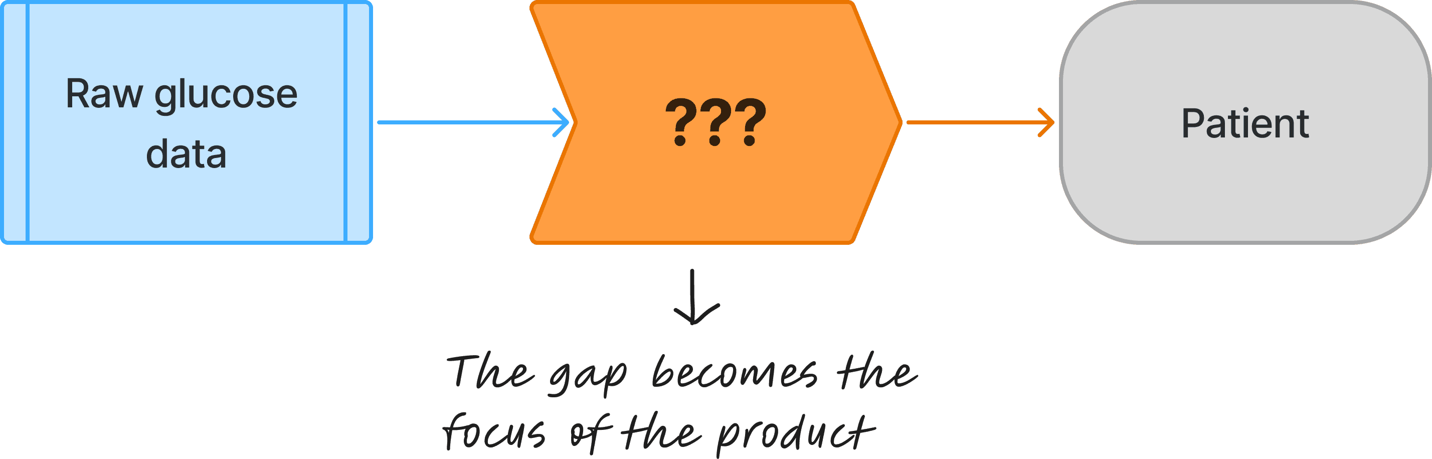
The interpretation layer becomes the gap the product had to fill.
Traditional CGM Apps:
A1C lifestyle App:
The research
Users weren't ignoring the data. They just had no way to act on it.
Research sessions with Type 2 and prediabetic users revealed a consistent pattern: people could see their glucose fluctuating, but couldn't connect it to anything they did.
Without a doctor to explain the numbers, users fell into two responses — anxiety or avoidance. Neither led to behavior change.
"I'm a of looking at my glucose data. If it's a bad number, it ruins my mood."
— Mary, type 2 diabetic
"Most of the time I don't know what I did wrong."
— Peter, pre-diabetic
"I tried lots of things to manage my glucose. Diets, exercises…But I don't know if anything is truly effective. It's a guess game. "
— HH, type 2 diabetic
The gap wasn't motivation. It was interpretation.
the system
The app had to replace what the doctor used to do — summarize, locate, and explain.
Each component was designed to eliminate one interpretation step the user had been doing alone.
Together they answer the only three questions that matter after seeing a glucose reading: how did I do, when did it happen, and why.
The doctor's job broken into three questions:
HOW did I do today?
↓
Cori Score
WHEN did it happen?
↓
Cori Ring
WHY did it happen?
↓
Curve Stamps
Cori Score - The How
One daily score combining glucose, activity, and time in range (TIR).
Users know HOW they did without interpreting a single number.

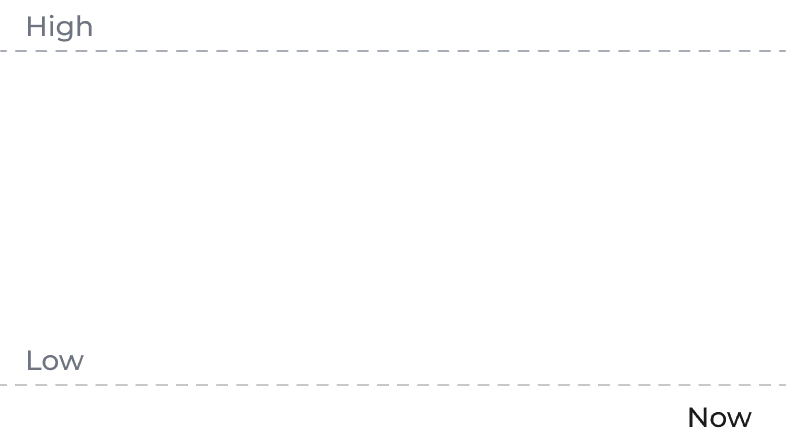
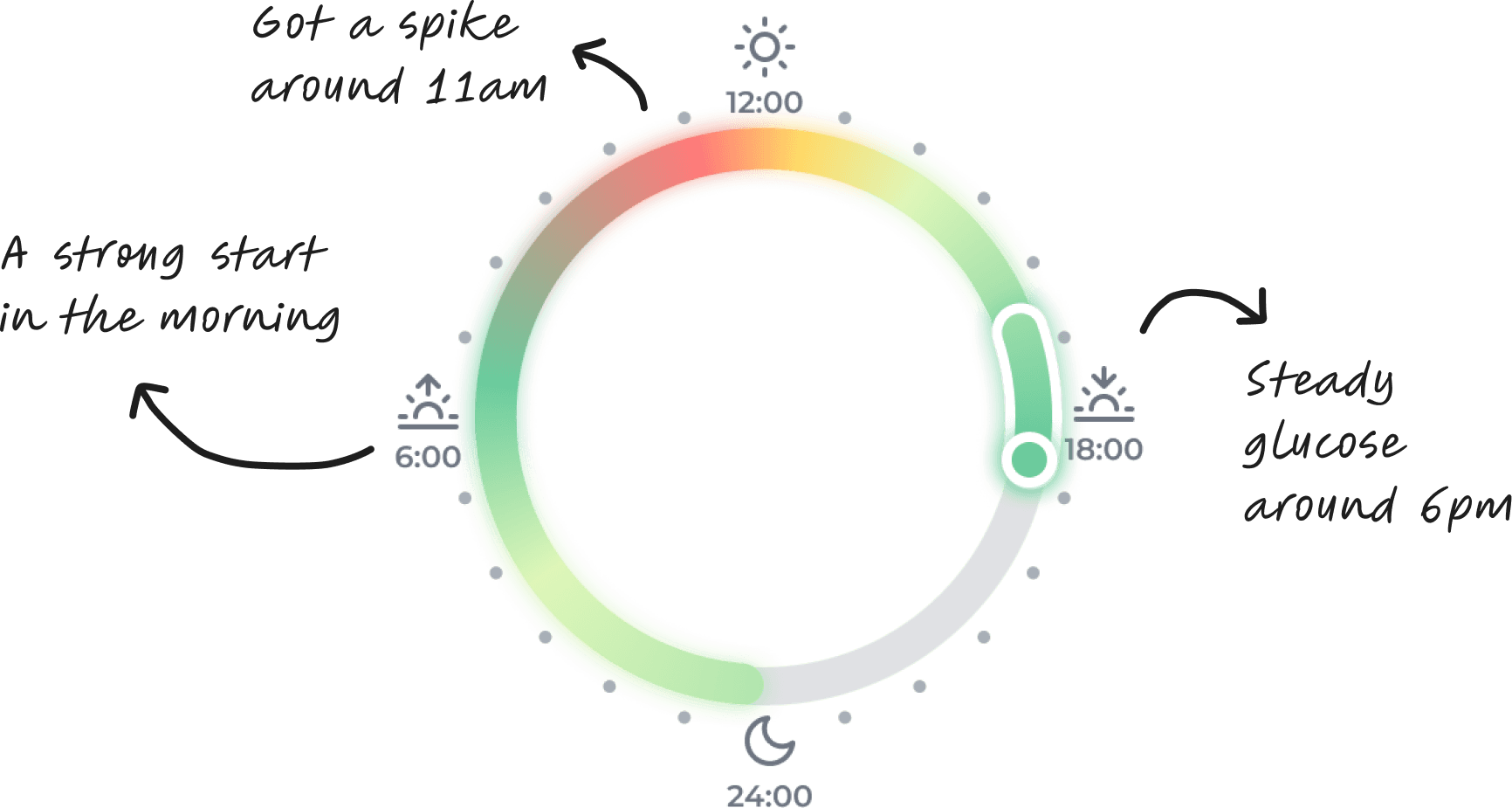
Cori Ring - The When
A 24-hour color-coded map of glucose performance.
Users see exactly WHEN in the day things went wrong.
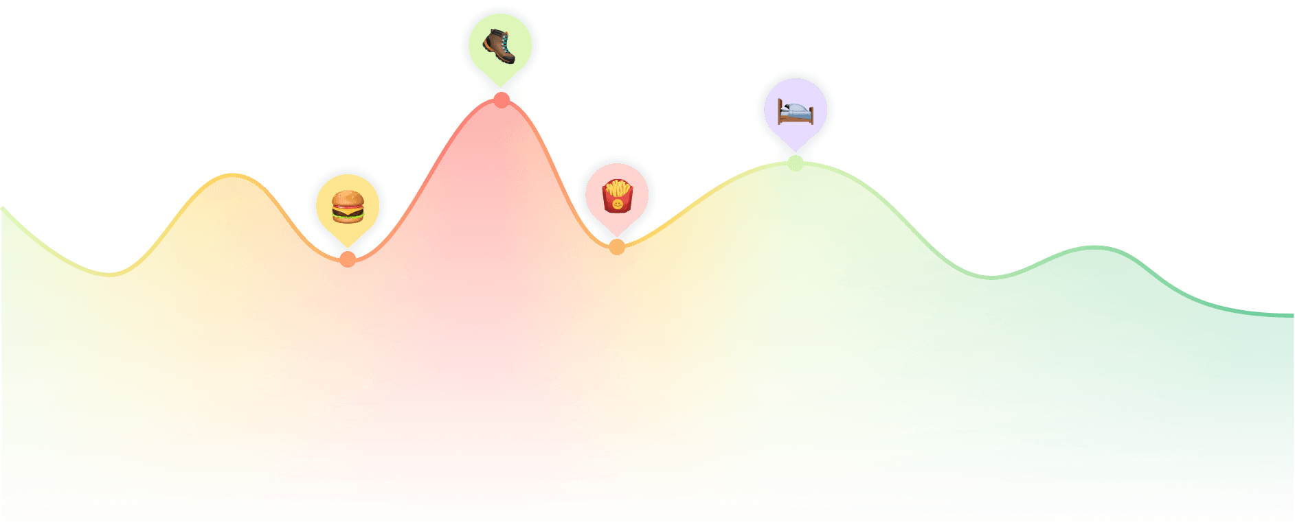
Glucose Curve Stamps - The What
Food, water, and activity overlaid directly on the glucose curve.
Users see WHAT caused the spike — not just that it happened.